

Chapters
Browse all chapters
Getting started
Editing
- Pages
- The page editor
- Site header, footer and partials
- Design and appearance
- Media library
- Blog
Site & domains
Billing & account
AI
FAQ
Design and appearance
Appearance controls the look of the whole site: template, colour theme, fonts, dark mode, corner rounding and buttons. Content stays put when you change any of them.
Template and theme
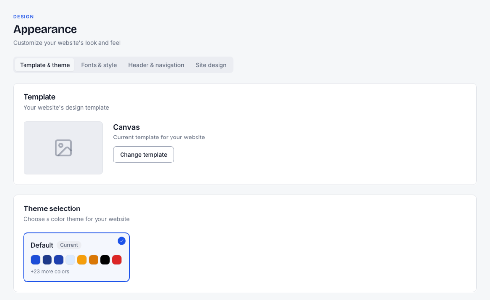
- Change template swaps the design. Your pages, posts and settings are kept; sections are redrawn in the new style.
- Theme selection picks a colour palette for the template. The card shows the main colours; the rest ("+23 more colors") cover hovers, light tints, states and greys. Highlights and buttons use these colours, so a new theme recolours them too.
Fonts, direction, dark mode and shapes
The Fonts & style tab holds the typographic and shape settings.
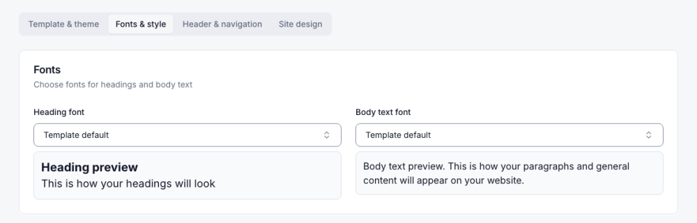
| Setting | Options |
|---|---|
| Heading font, Body text font | Template default or any listed font, with a preview |
| Text direction | Right-to-left (RTL) for Arabic, Hebrew or Persian |
| Dark mode | Only light, Only dark, Use system, Allow toggle |
| Corner rounding | Template, Sharp, S, M, L, XL, 2XL, for cards, inputs and similar |
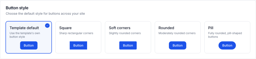
| Button style | Template default, Square, Soft corners, Rounded, Pill |

To check dark mode while editing, press the moon in the editor toolbar. Only the preview changes; visitors see what the Dark mode setting says.
Logos and favicon
Logos live in Settings → General.
- Logo: shown in the header and footer. Until you upload one, Webmarlin uses a monogram it generated from the site name.
- Logo for dark backgrounds (optional): used automatically on dark sections and in dark mode, so a dark logo never disappears on a dark header.
- Logo max height / max width: size limits in pixels. The same sliders are in the header panel.
- Favicon: the small icon in the browser tab. SVG files work for logos and favicons.
Header & navigation
This tab has the same header switches as the in-editor header panel (show logo, sticky header, website name, navbar buttons), plus Show Preheader By Default. See Site header, footer and partials.
Site design (custom CSS)
For designers: Site design holds one stylesheet for the whole site and a list of Libraries (fonts, icon sets or small scripts from approved CDNs such as Google Fonts, cdnjs or jsDelivr, up to 10).
- Every save is kept under Versions, so you can go back.
- The stylesheet is applied by the Canvas template. On other templates, use each section's Design options, or ask the AI to style one element (see AI features).
- An AI assistant connected to your site can also write it (the
set_site_csstool).
Most owners never need CSS: section Design menus cover background, spacing, borders, effects and alignment, and Copy style / Paste style reuses a look.