Chapters
Browse all chapters
Getting started
Editing
Site & domains
Billing & account
AI
FAQ
The page editor
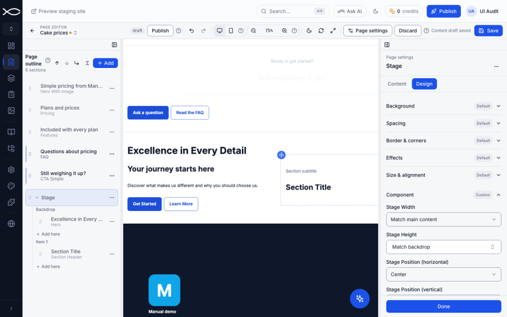
The editor shows your real page in the middle and lets you change it where it stands: click text to type, click a section to set it up, drag to rearrange. Every change is kept as a draft until you save and publish.
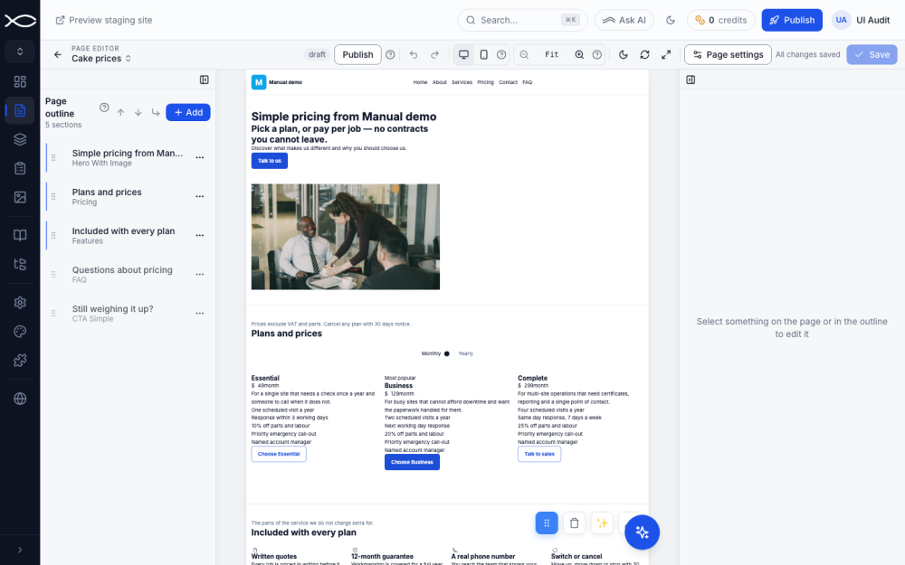
The three panes
| Pane | What it does |
|---|---|
| Page outline (left) | Lists the page's sections in order. Drag to reorder; ⋯ opens the section menu; + Add adds a section. |
| Canvas (middle) | The live page. Click anything to select it; click text to type in place. |
| Settings (right) | The fields of whatever is selected, in Content and Design tabs. Done closes it. |
The small icons at the top of each pane collapse it when you want more room.
The toolbar
| Control | What it does |
|---|---|
| Page name ↕ | Switches to another page |
| Status + Publish / Unpublish | Shows draft or published; publishes or unpublishes this page |
| Undo / Redo | Steps back or forward (Ctrl+Z, Ctrl+Shift+Z) |
| Desktop / Mobile preview | Shows the page at computer or phone width |
| Zoom out, level, zoom in | Makes the canvas smaller or larger (⌘−, ⌘+); Fit fits it to the pane. Zoom never changes what visitors see |
| Moon | Previews the page in dark mode |
| Reload | Redraws the preview |
| Expand | Maximises the canvas |
| Page settings | Header/footer visibility and SEO (see Pages) |
| Discard / Save | Throws away or keeps your draft |
Drafts, Save and Publish
- As you work, the toolbar says Content draft saved: your edits are stored as a draft, even if you close the tab.
- Save writes the draft to the staging site. Discard throws it away and returns to the last saved version.
- Publish makes the saved page live for visitors.
Preview staging site in the top bar opens the saved-but-unpublished version so you can check it first.
Edit text in place
Click any text on the canvas and type. Select words to get the formatting toolbar.
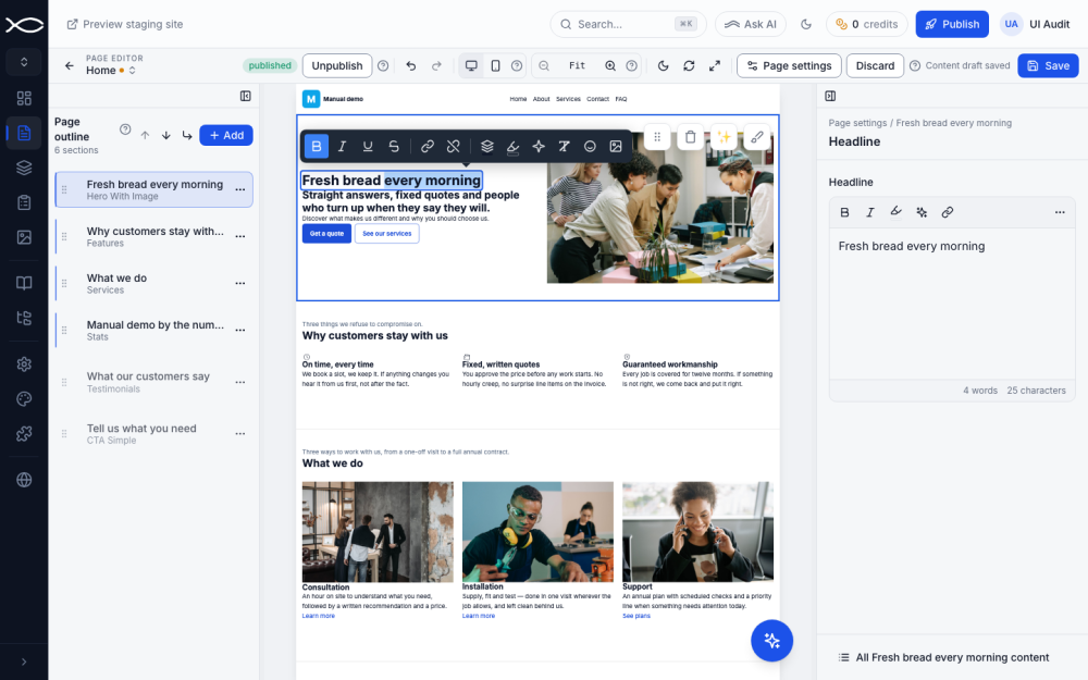
The toolbar offers bold, italic, underline, strikethrough, links, Text color, Highlight, Text effect, Clear formatting, Insert icon and Insert image. The same field also appears in the settings pane, with a word and character count.
Highlight and text effects
Highlight paints a marker-pen colour behind words; text effects add a glow, a shadow or an outline to them.
- Select the words, in the canvas or in the settings pane.
- Click Highlight (the marker icon). Pick one of your Theme colors, or set a Custom color and Opacity, then Apply color. Remove highlight takes it off.
- For an effect, select words and click Text effect (the sparkle icon), then choose Glow, Shadow or Outline. None removes it.
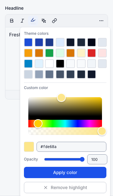
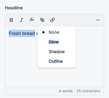
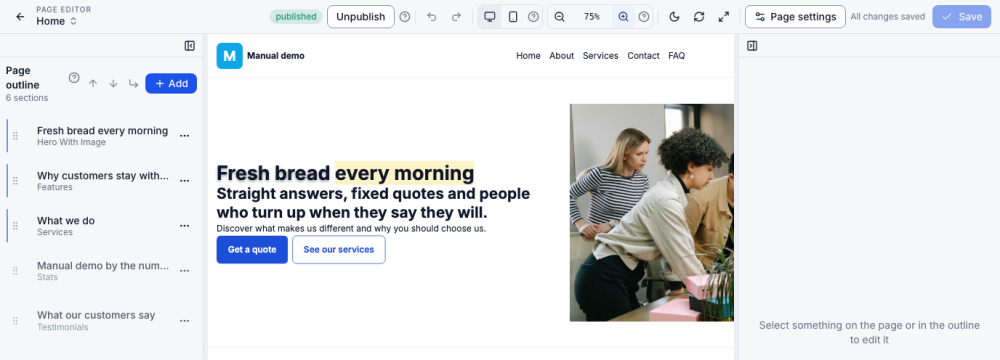
Theme-colour highlights follow your palette, so they adapt if you change colours or switch to dark mode.
Add, move and remove sections
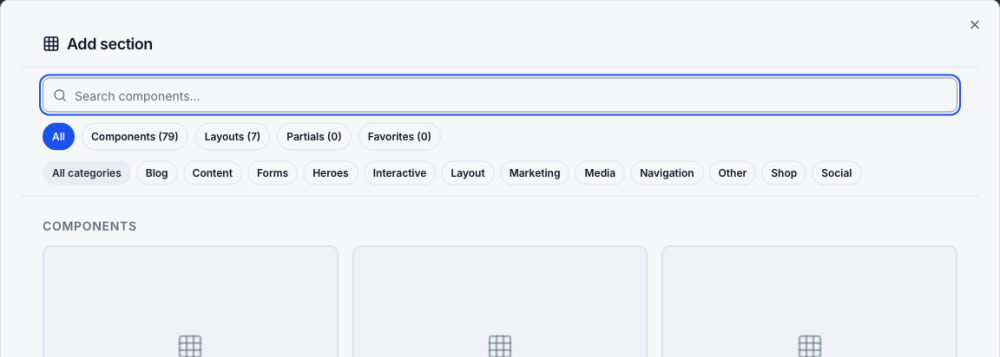
- + Add in the outline, or Add section on an empty page, opens the section library. Search by name or purpose ("pricing", "gallery"), or filter by category. Favorites holds sections you saved.
- Drag a section by its grip in the outline, or use Move up, Move down and Move to….
- On the canvas, a selected section shows four buttons: drag to move, delete, Edit with AI (sparkle) and Section Style (brush). Handles on its edges resize it by snapping through the design's spacing and height presets.
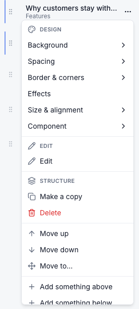
The section ⋯ menu gathers everything else:
| Group | Items |
|---|---|
| Design | Background, Spacing, Border & corners, Effects, Size & alignment, Component |
| Structure | Make a copy, Delete, Move up/down/to, Add something above/below |
| Layout | Put into 2 columns, Put into 3 columns |
| Visibility | Hide on phones, Hide on computers |
| Style | Copy style, Paste style (applies one section's look to another) |
| Other | Change with AI, Save to favorites |
Layouts: columns and Stage
Layouts hold other sections. Pick one from Layouts in the library: Section, Flexible Row (2 or 3 columns), Accordion, Tabs, Stacks and Modal.
Stage is for designs where things float over a picture, video or map, such as a badge or a price tag over a hero. It has two layers:
- Backdrop: a normal slot that takes any section and sets the height.
- Stage items: things placed freely on top. Each item has its own slot.
- Search the library for Stage and add it.
- In the outline, click Add here under Backdrop and choose a section (for example Hero).
- Click Add here under Item 1 and choose what floats on top. Add item adds more.
- Drag an item's blue grip on the canvas to place it, with snapping and centre guides. Arrow keys nudge it; Shift moves it further.
- In Design → Component, set the stage size (match the main content or a % of the window), its position, and what happens On Phones.
| On Phones | Result |
|---|---|
| Stack items (default) | Items drop below (or above) the backdrop, one after another |
| Reposition items | Items stay on the backdrop at separate phone positions you set in the mobile preview |
| Scale the whole stage | The whole design shrinks to fit, like a picture |
Each item can also follow the stage setting, always stack, or be repositioned on its own.
Images and media
Click an image on the canvas to open Select image. Pick one from your media library, or use Add media to upload from your device or Search stock photos for free images. A red No desc badge marks an image without alt text; add a description in Media so screen readers and search engines understand it.
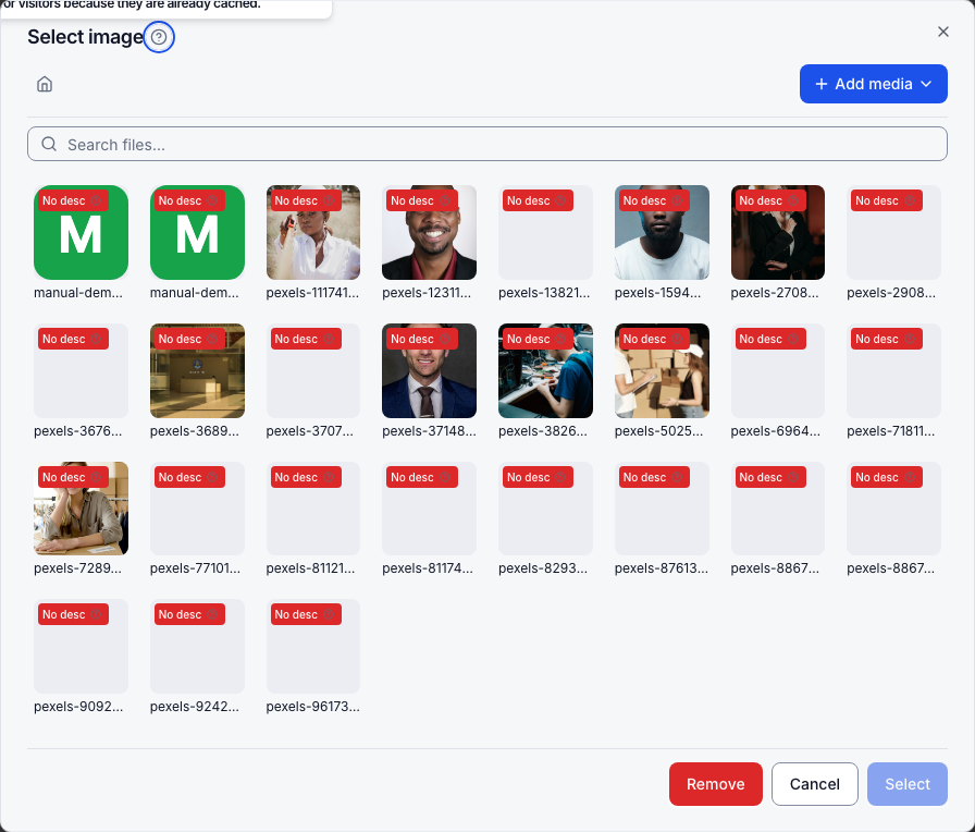
In the settings pane an image field also has Crop and Replace.
Editing on a phone
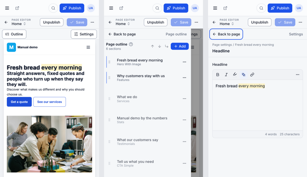
The editor works on a phone. The page takes the full width; Outline and Settings open as sheets that slide over it, and Back to page closes them. Tap text to edit it; the same formatting, highlight and effect tools are there.